Income Distribution:India



This is a collection of articles archived for the excellence of their content. Readers will be able to edit existing articles and post new articles directly |
Contents |
Disparities
Rich getting richer/ 2010
120k Indians hold a third of national income
Marks Increase Of More Than 50% Over 2008 Figure: Study
Rukmini Shrinivasan
New Delhi: Last year [2010?] may have been a cruel year for much of the country with slow growth and double-digit food inflation, but India’s high net worth individuals (HNWIs) prospered — just over 120,000 in number, or 0.01% of the population, their combined worth is close to one-third of India’s Gross National Income (GNI).
HNWIs, in this context, are defined as those having investable assets of $1 million or more, excluding primary residence, collectibles, consumables, and consumer durables. According to the 2009 Asia-Pacific Wealth Report, brought out by financial services firms Capgemini and Merrill Lynch Wealth Management, at the peak of the recession in 2008, India had 84,000 HNWIs with a combined net worth of $310 billion. To put that figure in perspective, it was just under a third of India’s market capitalization, that is, the total value of all companies listed on the Bombay Stock Exchange — as of end-March 2008. The average worth of each HNWI was Rs 16.6 crore.
To get a fix on just how rarefied a level it puts them in, we did some simple calculations that threw up stunning numbers. It would take an average urban Indian 2,238 years, based on the monthly per capita expenditure estimates in the 2007-8 National Sample Survey, to achieve a net worth equal to that of the average HNWI. And that’s assuming that this average urban Indian just accumulates all his income without consuming anything. A similar calculation shows that an average rural Indian would have to wait a fair bit longer — 3,814 years!
According to the firms’ 2010 World Wealth Report, India now has 126,700 HNWIs, an increase of more than 50% over the 2008 number.
While the figure for combined net worth is not available, it seems safe to assume that as a class not only have India’s super-rich recouped their 2008 losses, they have even made gains over their pre-crisis (2007) positions. In 2007, 123,000 HNWIs were worth a combined $437 million.
Meanwhile, in 2009 alone, an estimated 13.6 million more people in India became poor or remained in poverty than would have been the case had the 2008 growth rates continued, according to the United Nations Department of Economic and Social Affairs (UNDESA). Also, an estimated 33.6 million more people in India became poor or remained in poverty over 2008 and 2009 than would have been poor had the pre-crisis (2004-7) growth rates been maintained over these two years.
The 2009 Asia-Pacific Wealth Report notes that the HNWI population in India is also expected to be more than three times its 2008 size by the year 2018, with emergent wealth playing a key role. Like China, relatively few among the current HNWI population (13%, compared to 22% in Japan) have inherited their wealth and even fewer (9%) are over the age of 66.
2014: Income inequality highest since 1922
India has gone from British Raj to Billionaire Raj: Report, Sep 6, 2017: The Times of India
HIGHLIGHTS
The top 1% of earners captured less than 21% of total income in the late 1930s in India
It dropped to 6% in early 80s
Now, it is 22%, highest since 1922, when the income tax law was conceived
Income inequality is shown to have fallen to the least in the 1970s and the 1980sIncome inequality is shown to have fallen to the least in the 1970s and the 1980s
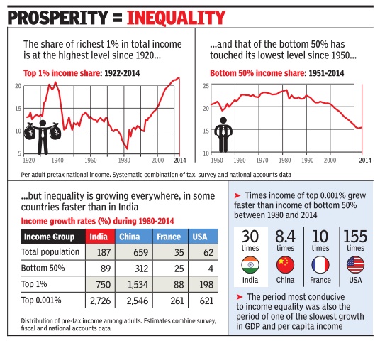
Inequality in India may be at its highest level since 1922, when the country's income tax law was conceived, with 22% income accruing to the top 1% income earners, a new paper released by economists Thomas Piketty and Lucas Chancel showed.
"The top 1% of earners captured less than 21% of total income in the late 1930s, before dropping to 6% in early 1980s and rising to 22% today," said the paper titled 'Indian income inequality, 1922-2014: From British Raj to Billionaire Raj?', a revised version of which was released.
Incidentally, the 1970s and the 1980s, when income inequality is shown to have fallen to the least was the period when India's GDP and per capita income growth rates fell to one of the lowest levels. The trend in India is in line with the experience of other major economies.
The paper shows that between 1980 and 2014, income of top 0.1% income earners in France and China rose six times faster than the income of bottom 50%. In India, the growth rate of top 1% was 13 times higher, while it was nearly 77 times higher in the US.
The paper from Picketty and Chancel is expected to trigger debate about the state of inequality in India and whether benefits of higher growth have spread to all classes.
The two economists recognise the global nature of income inequality but state that: "India's dynamics are striking: It is the country with the highest gap between the growth of the top 1% and growth of the full population."
The paper added that the top 0.1% income earners represented less than 8 lakh individuals in 2013-14, which is less than the population of Gurgaon. "It is a sharp contrast with the 389 million individuals that made up the bottom half of the adult population in late 2013."
Economists say that income distribution data for India is very difficult to find. A study done by Delhi-based NCAER dates to 2004-05. "Income tax data is not applicable (for measuring income inequality) in a country like India," said Bibek Debroy, member of NITI Aayog, a government think tank.
"The national sample survey (NSS) data indicated that in 2004-05 inequality in India increased sharply. The NSS measures consumption and underestimates the degree of inequality," said Pronab Sen, former chief statistician of India. "If you could measure income distribution, which very few do, it is much worse." Sen said, India's fast economic growth had helped in reducing absolute poverty. "But relative inequality has worsened."
Based on their calculations, Piketty and Chancel have concluded that there was a moderate rise of the middle class during 1980-2014, when the economy was liberalised and income growth rates picked up.
"'Shining India' corresponds to the top 10% of the population (approximately 80 million adult individuals in 2014) rather than the middle 40%. Relatively speaking, the shining decades for the middle 40% group corresponded to the 1951-1980 period, when this group captured a much higher share of total growth (49%) than it did over the past 40 years," they said.
The paper's authors also said they did not have the capacity to put an end to the debates over the impact of reforms on inequality or poverty.
Disparities: Chancel, Piketty, 1922- 2014
Complete text of ‘British to Billionaire Raj’
WID document: Chancel and Piketty
Lucas Chancel, Thomas Piketty, July 2017
First draft: July 1st, 2017, Online publication: September 5, 2017, This version: September 7, 2017
Indian income inequality, 1922-2014: From British Raj to Billionaire Raj ?
Abstract. We combine household surveys and national accounts, as well as recently released tax data in a systematic way to track the dynamics of Indian income inequality from 1922 to 2014. According to our benchmark estimates, the share of national income accruing to the top 1% income earners is now at its highest level since the creation of the Indian Income tax in 1922. The top 1% of earners captured less than 21% of total income in the late 1930s, before dropping to 6% in the early 1980s and rising to 22% today.
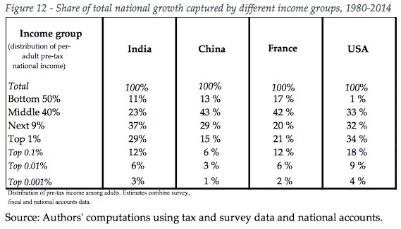
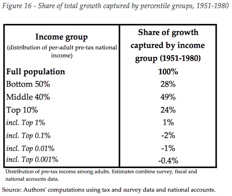
Over the 1951-1980 period, the bottom 50% group captured 28% of total growth and incomes of this group grew faster than the average, while the top 0.1% incomes decreased. Over the 1980-2014 period, the situation was reversed; the top 0.1% of earners captured a higher share of total growth than the bottom 50% (12% vs. 11%), while the top 1% received a higher share of total growth than the middle 40% (29% vs. 23%). These findings suggest that much can be done to promote more inclusive growth in India. Our results also appear to be robust to a range of alternative assumptions seeking to address data limitations. Most importantly, we stress the need for more democratic transparency on income and wealth statistics to avoid another "black decade" similar to the 2000s, during which India entered the digital age but stopped publishing tax statistics. Such data sources are key to track the long run evolution of inequality and to allow an informed democratic debate on inequality.
India introduced an individual income tax with the Income Tax Act of 1922, under the British colonial administration. From this date, up to the turn of the 20th century, the Indian Income Tax Department produced income tax tabulations, making it possible to track the long-run evolution of top incomes in a systematic manner. Using this data, Banerjee and Piketty (2005) showed that the share of fiscal income accruing to the top 1% earners shrank substantially from the mid-1950s to the mid-1980s, from about 13% of fiscal income, to less than 5% in the early 1980s. The trend was reversed in the mid-1980s, when pro-business, market deregulation policies were implemented. The share of fiscal held of the top 1% doubled from approximately 5% to 10% in 2000.
According to National Accounts estimates, post-2000 income growth has been substantially higher than in the previous decades. Average annual real income growth was below 2% in the 1960 and 1970s, it reached 2.5% in the 1980s and 2% in the 1990s.
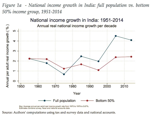
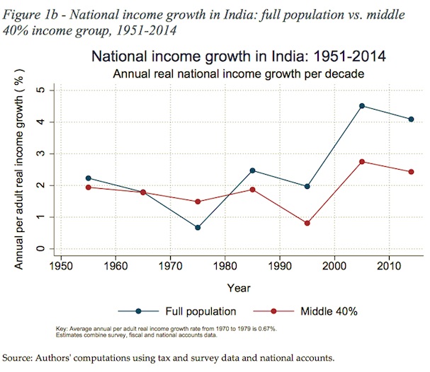
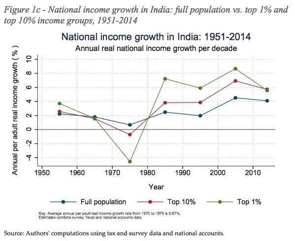
Since 2000s it is of 4.4% on average since 2000 (Figure 1). Little is known however on the distributional impacts of economic policies in India after 2000 in part because the Income Tax Department stopped publishing income tax statistics in 2000, and also because self-reported survey data does not provide adequate information concerning the top of the distribution (fiscal data is not perfect either, but it delivers higher and more plausible income levels for the top). In 2016, the Income Tax Department released tax tabulations for recent years (2011- 12, 2012-13 and 2013-14), making it possible to revise and update previously published top income estimates and better inform public debates on growth and income inequality. We find that the bottom 50% group grew at a substantially lower rate than average growth (Figure 1a) since the 1980s. Middle 40% grew at a slower rate than the average (Figure 1b). On the contrary, top 10% and top 1% grew substantially faster than the average since 1980 (Figure 1c).
The first objective of this paper is to mobilize this newly released set of tax data in order to track the evolution of income inequality from 1922 to 2014. The second objective is to go beyond top income shares and produce estimates of income dynamics throughout the entire distribution using concepts that are consistent with National Accounts (following, as much as possible, the Distributional National Accounts Methodology, see Alvaredo et al., 2016).
To do so, we combine in a systematic manner household survey, fiscal and national accounts data. Such an exercise is fraught with methodological and conceptual difficulties given the lack of consistent historical income inequality data in India. Indeed, the tax data available only covers the very top of the distribution of Indian earners (more than 6% of total population in 2014). In addition, the National Sample Survey Organization (NSSO) household surveys measure consumption rather than income. We repeatedly stress that there are strong limitations to available data sources, and that more democratic transparency on income and wealth statistics is highly needed in India. That said, we find that our key results are robust to a large set of alternative assumptions made to address data gaps. The present paper should be viewed as an exercise in transparency: we propose a method to combine the different available sources (in particular national accounts, tax and survey data) in the most possible transparent way, and we very much hope that new data sources will become available in the future so that more refined estimates can be constructed. All our computer codes are available on-line so that everybody can use them and contribute to improve the methods.
The rest of this paper is organized as follows. Section 1 discusses the Indian income inequality data gap of the past two decades, section 2 describes our data sources and methodology, section 3 presents our key findings, section 4 briefly discusses their policy relevance and section 5 concludes.
1 ENTERING THE DIGITAL AGE WITHOUT INEQUALITY DATA
1.1 Economic policy shifts since the 1980s
Over the past thirty years, the Indian economy went through profound evolutions. In the late seventies, India was recognized as a highly regulated economy with socialist planning. From the 1980s onwards, a large set of liberalization and deregulation reforms were implemented. In this context, it is unfortunate that Indian authorities stopped in 2000 publishing income tax tabulations, which represent a key source of data to track consistently the evolution of top incomes.
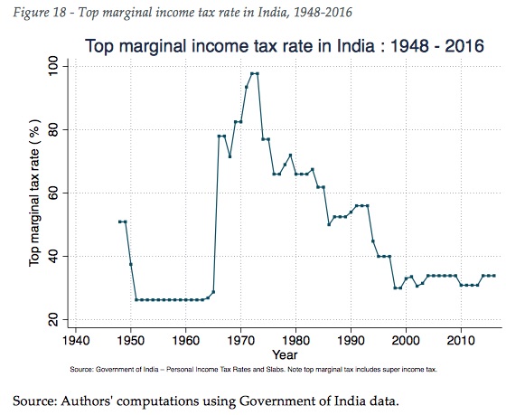
Under Prime Minister Jawaharlal Nehru (in power from 1947 to 1964), India was a statist, centrally directed and regulated economy. Transport, agriculture and construction sectors were owned and administered by the Central Government, commodity prices were regulated and the country had important trade barriers. Nehru's followers, including Indira Gandhi's (1966-77 and 1980- 1984) prolonged these policies and implemented a highly progressive tax system. In the early 1970s, the top marginal income tax rate reached record high levels (up to 97.5%). From the mid 1980s onwards, liberalization and trade openness became recurrent themes among Indian policymakers. The Seventh Plan (1985-1990), led by Rajiv Gandhi (1984-1989), promoted the relaxation of market regulation, with increased external borrowing and increased imports. The tax system was also gradually transformed, with top marginal income tax rates falling to 50% in the mid-1980s. In the late 1980s, when India faced a balance of payment crisis, it called for International Monetary Fund assistance. Financial support was conditioned to structural reforms which pushed forward the deregulation and liberalization agenda.
What came to be known as the first set of economic reforms (1991-2000) placed the promotion of the private sector at the heart of economic policies, via denationalizations, disinvestment of the public sector, deregulation (dereservation and delicencing of public companies and industries). These reforms were implemented both by the Congress government of N. Rao (1991-1996) and its successors, including the conservative Janata Party government of A. Vajpayee (1998-2004). The reforms were prolonged after 2000, under the 10th and subsequent five-year plans. These plans ended government fixation of petrol, sugar or fertilizer prices and led to further privatizations, in the agricultural sector in particular.
The impacts of these reforms in terms of growth has been praised by public authorities. Real per adult national income growth, which has more sense from the point of view of individual incomes than commonly used GDP, significantly increased after the reforms. It was 0.7% in the 1970s, 2.5% in the 1980s, 2.0% in the 1990s and 4.4% since 2000 (Figure 1). However, little is known on the distributional characteristics of post-2000 growth.
1.2 The income inequality data gap
Public debate over liberalization policies largely focused on their macroeconomic impacts (Ramaswami, Kotwal, Wadhwa, 2011) and on the impacts on poverty, with a substantial reduction in poverty rates (World Bank, 2017; Deaton & Dreze, 2002; Deaton & Kozel, 2005). How the Indian economy fared in terms of inequality has been arguably less discussed. This can partly be explained by a lack of consistent data on the distribution of incomes or wealth for the recent period.
Some evidence suggesting a rise in income inequality in India after the turn of the century can however be found in NSSO surveys and other sources available in openly-available sources. Figure 2 presents the share of total consumption attributable to the top 20% of consumers, available online from the World Bank and United Nations WIDER World Income Inequality Database (UN-WIDER WIID). The data shows a decrease in top quintile consumption share from the fifties to the seventies from around 43% to 40% and an increase thereafter (in line with Banerjee and Piketty findings) to close to 44%. There are important irregularities with the data, but the overall "U-shape" trend seems relatively consistent.
The shortcomings of household survey data in monitoring the evolution of inequality are well known; because of underreporting and undersampling issues, surveys fail to properly capture inequality dynamics at the top of the distribution (Atkinson and Piketty, 2007, 2010). What is more, NSSO surveys only focus on consumption rather than income and the distributional dynamics of these two concepts can differ notably. In addition, the relatively limited magnitude of the changes observed in NSSO data calls for care in the interpretation of such results. Consumption data available through surveys constitutes part of the evidence, but are not sufficient to inform debates on Indian inequality.
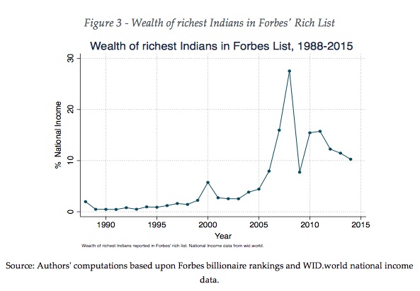
Other data sources, such as Forbes' Indian Rich lists, suggest an important increase in the wealth of the richest Indians after 2000 (see Figure 3). The wealth of the richest Indians reported in Forbes' India Rich List, amounted to less than 2% of National income in the 1990sn, but increased substantially throughout the 2000s, reaching 10% in 2015 and with a peak of 27% before the 2008-9 financial crisis. Such data suggests a rise in wealth inequality levels throughout the post-2000 period, but does not enable a consistent analysis of income inequality over the long run. This is confirmed by simple simulations using a fixed normalized wealth distribution and taking into account rising average nominal wealth over the period (unfortunately Indian wealth data is very limited so it is difficult to go further).
The release of income tax tabulations by the Income Tax Department for the post 2011 period does, however, allow for a more consistent analysis of the dynamics of income in India since the turn of the century.
2 DATA SOURCES AND METHODOLOGY
We present the data used to produce series on the evolution of income for the entire distribution from 1951 to 2014 (period covered by both household surveys and tax data, as well as national accounts) and for the evolution of incomes of the top 1% share and above from 1922 to 2014 (period covered by tax data and national accounts only, with no survey data prior to 1951).
2.1 Description of the different data sources
2.1.1 Tax data
The Indian Income Tax Department released tax tabulations for the fiscal years 1922-1923 to 1998-1999, and interrupted the publication in 2000. After several public calls for more democratic transparency over Indian inequality data, the ITA released tax tabulation for years 2011-12 to 2013-14. All these tabulations report the number of taxpayers and the gross and returned income for a large number of income brackets. Gross income corresponds to pre-tax income before certain deductions are applied to compute returned income. Tax units are defined as individuals or Hindu Undivided Families (HUF, family clusters allowed to file their income jointly). The number of HUF represented roughly 20 % of tax returns in the interwar period, 5% in 1990 and less than 2.5% in 2011.
The exact reason why Indian tax administration stopped publishing data in 2000 remains unknown. One potential explanation for this is the change in the sampling method employed in the late 1990s, with a resulting loss in the precision of estimates. Indeed, official tax tabulations were based on the entire population until the early 1990s - or based on stratified samples with sampling rates close to 100 percent for top incomes as is the case in most OECD countries, but seem to be based on uniform samples of all tax returns after this period and up to 2000 (Banerjee and Piketty, 2005). The latter method led to less precise results. Another potential explanation for the halt in tax reporting could just be the lack of interest in income statistics and inequality (which given the rise in top income shares observed from mid 1980s to 2000 seems rather surprising).
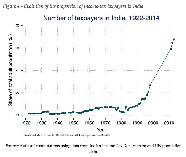
Interestingly enough, the number income tax payers in India has increased substantially over the past decades. Less than 0.5% of the population filing tax returns up to the 1950s, between 0.2 and 1% over the period between 1960 to 1990, before a substantial increase thereafter; from 1% to close to 3% in the late 1990s and more than 6% in the latest period (Figure 4). This increase over twenty years is impressive, yet comparatively, the current figure is similar to the levels observed in France and in the USA in the late 1910s, and much lower than the levels observed in the interwar period (about 10-15%) and in the decades following World War 2 (50% or more) in these two countries (Piketty, 2001; Piketty and Saez, 2003). With revenues from income tax equivalent to approximately 2% of GDP, India receives more revenue than China (1%), but significantly less than other emerging countries such as Brazil and Russia (4%), and South Africa and the OECD countries (9%) (OECD, 2017).
2.1.2 NSSO consumption data
The NSSO, led by the Ministry of Statistics and Program Implementation started an all-India consumer household expenditure survey (AIHS) after its independence in 1947. The first round of the AIHS was carried out in 1951 and surveys were then conducted on an annual basis. The size of rounds varies since the quinquennial AIHS has a larger sampling of about 120 000 households and five times less for smaller other rounds. The reach of the quinquennial survey is extensive in terms of consumption items (ranging from daily used food, clothing to durable goods and services such as construction, education and healthcare). NSSO surveys however do not measure individual or household incomes, in part because agricultural and business incomes are judged to be volatile and assumed to be much less reliably measured than consumption.
Since the first survey rounds, NSSO produced 30 days reference period estimates. This period is known as the Universal Reference Period. Post-1990, concerns were raised about the sensitivity of the reference period on the estimates and NSSO started publishing alternative reference periods (7 days and 365 days). As Deaton and Kozel (2005) note, shorter recall periods tend to lead to higher consumption estimates. However, experiments carried out with different reference periods by the NSSO working group concerned concluded that there is no clear superiority of a period over another. We thus use the Universal Reference Period. This choice is also motivated by the fact that the 30 days period is the only one that is consistent throughout the entire period of analysis (1951-2014).
For recent years (1983 to 2011) we use quinquennial rounds 38 (1983), 43 (1987-88), 50 (1993-94), 55 (1999-2000), 61(2004-05), 66 (2009-10). Micro data at the household level was obtained from the NSSO. For earlier rounds (rounds 3 to 32), for which we could not access micro data files, we use the Poverty and Growth in India Database of the World Bank (Ozler et al., 1996) which provides rural and urban per capita consumption tabulations for a dozen quantile groups for years 1951 to 1978. All rounds and corresponding years used are summarized in Appendix 3, along with the summary statistics of each round. We describe in section 2.2.2 the procedure used to infer the full distribution of income from these surveys and how we interpolate missing years.
2.1.3 National Accounts data
From 1950 to the present day, we use GDP data from WID.world, based on National Accounts Statistics (NAS) from 1971 to 2013, on World Bank (after 2013) and on Maddison (2007) from 1950 to 1970. WID.world then performs its own computations to infer Net Foreign Income and Consumption of Fixed Capital (Blanchet and Chancel, 2016). Before 1950, we use historical National Income growth rates from Sivasubramonian (2000).
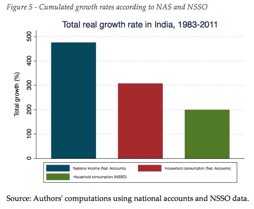
A well know puzzle in Indian statistics (Deaton and Kozel, 2005; CSO, 2008) pertains to the difference in survey consumption growth rates and national accounts growth rates, particularly during the recent period. Figure 5 shows the total growth rate of Net National Income and Household Final Consumption Expenditure from NAS and personal consumption from NSSO, from 1983 to 2011. According to NAS, national income grew at 475% and household consumption grew at slightly more than 300%, while NSSO data indicates that household consumption grew at 200%. Several reasons have been put forward to explain this gap, including (i) population coverage (it is different between NSSO and NAS, since Non Profit Institutions Serving Households and homeless individuals are not covered by NSSO surveys); (ii) valuation and integration of certain types of services in survey questionnaires (it was argued that the treatment of cooked meals served by employers to employees leads to underestimation of the total value of services consumed by households in the NSSO surveys (CSO, 2008) while other services such as financial intermediation that are particularly important among top earners, are not included in survey estimates (Sundaram and Tendulkar, 2005); (iii) imputed rents (while the NAS incorporates imputed rents, NSSO surveys do not); (iv) consistency of National Accounts estimates (Kulshreshtha and Kar, 2005) ; (v) under-reporting and under-sampling of top incomes in survey data (Banerjee and Piketty, 2005). We should stress from the outset that we do not pretend to solve this complex issue. The divergence probably involves several, if not all of the factors above cited. What we seek here is to better estimate the fraction of the difference that can be explained by the absence of top earners in survey data. We do not think that this factor alone can explain the entire gap, as it has sometime been suggested (Lakner and Milanovic, 2015).
2.1.4 IHDS income and consumption survey
The Inter University Consortium for Applied Political and Social Sciences Research (ICPSR), based at the University of Michigan, provides access to the India Human Development Survey (IHDS), conducted in 2005 and 2011-12 among more than 40 000 households from rural and urban areas. The survey provides information at the household level on both income and consumption. Consumption related questions were designed so as to match the NSSO questionnaire, using similar item categories and similar referencing periods. The definition of income in the IHDS survey includes all sources of income: labour income (wages and pensions), capital income (rents, interests, dividends, capital gains) as well as mixed (or business) incomes15. Government benefits, reported in the survey, are excluded from the analysis for consistency with tax tabulations; our focus is pre-tax income. The IHDS is one of the very few surveys estimating both consumption and income in India. This is particularly useful as it enables a tentative reconstruction of NSSO unobserved income levels, using IHDS information. We describe this methodology in section 2.2.2. IHDS micro data is also openly available via the ICPSR website, which makes it particularly convenient.
2.1.5 UN statistics population data
We define the theoretical population of tax payers as the total number of adult individuals in India. We use adult population data from UN Population Prospects (2015) from 1950 to today. UN Population prospects provide 5-year age range annual population tables, based on national census and their own estimation procedures. The adult population is defined as the number of individuals over age 20. Before 1950, we use total population estimates from Sivasubramonian (2000) and reconstruct the adult population using total population growth rates given by the same author.
2.2 Methodology
2.2.1 Estimation of top fiscal incomes
Following Banerjee and Piketty (2005), we first reconstruct top income thresholds and levels, using generalized Pareto interpolation techniques. The main methodological difference with Banerjee and Piketty lies in the use of generalized Pareto interpolation techniques (Blanchet, Fournier and Piketty, 2017) rather than standard Pareto distributions. Generalized Pareto interpolation allows for the recovery of the distribution based on tax tabulations without the need for parametric approximations. This method has demonstrated its ability to produce very precise results and also has the advantage of generating smooth estimates of the distribution, i.e. generating a differentiable quantile function and a continuous density, while other methods introduce kinks around the thresholds used as inputs for the tabulation.
The generalized Pareto interpolation procedure generates 127 generalized percentiles, namely p0p1, p1p2, ..., p99p100, corresponding to 100 fractiles of the distribution. The top fractile is split into 10 deciles (p99.0 p99.1, p99.1 p99.2,..., p99.9p100), its top decile itself split in ten deciles (p99.90 p99.91, p99.91 p99.92, ..., p99.99 p100), the tenth decile again split in ten deciles (p99.990p99.991, p99.991 p99.992, ..., p99.999p100). The top generalized percentile thus corresponds to the top 0.001% of the population. As shown in Figure 4, tax data in India is only reliable above the p94 threshold for the recent period and above the p99.9 threshold when we go backwards in time.
2.2.2 Estimation of bottom survey incomes
One of the main difficulties of our exercise is related to the fact that NSSO does not include questions on individual and/or household income. Our strategy consists of using observed income-consumption profiles in IHDS data to reconstruct income profiles from NSSO consumption data. We first estimate income and consumption levels for each generalized percentile of the distribution of income and consumption given by IHDS data. For each survey and each percentile of the distribution, we construct observed income-consumption ratios α1p=yp/cp, with yp and cp respectively with a mean income and consumption within quantile p. We call this strategy A1. To obtain a theoretical income-consumption profile over percentiles, we take average of years 2005 and 2011-12. In practice, the two profiles differ only marginally. We then construct two alternative ratios, α2p and α0p, referred to as strategies A2 and A0 respectively. In strategy A2, we assume that α2p= 1 for α1p≤1 and α2p=α1p otherwise. This second strategy is equal to assuming no negative savings rates among the poor. In strategy A0, we define α0p=(α1p+α2p)/2 for α1p≤1. This strategy assumes that there can be negative savings rates, remittances or household transfers, but that the true αp value lies between strategy A1 and strategy A2. Income consumption ratios for the different strategies are presented in Appendix 4. We find that these different strategies have no effect on the trends we observe and a limited impact on top share estimates, as we show in section 3.4.
The choice of these different strategies indeed impacts on the estimated share of total savings in the economy. In strategy A1 total savings are close to 0, which seems too low compared to the current rate of savings in India (about 30%). This figure is close to 5% in strategy A0 and approximately 10% in strategy A2. These values are more or less constant throughout the entire period covered whereas in National accounts they move from about 10% in the 1960s to 30% today. However, using strategy A0 and factoring in top incomes in the analysis allows us to find an aggregate savings rate of the same order of magnitude as those observed today (see Appendix 5).
2.2.3 Interpolating survey and tax data for missing years.
Our objective is to produce yearly estimate for the full distribution from 1951 to 2014. Given that survey or tax data is not available for all years, it is necessary to interpolate tax and/or survey data for a certain number of years. In order to do so, we interpolate missing years using a constant growth rate between known intervals t and t+N.
As described in sections 2.1.2 and 2.1.4, we have two available sources for the estimation of survey income for the years 2005 and 20010-11, NSSO and IHDS. However, the trends observed in the surveys are somehow divergent. The ratio of reconstructed NSSO total income to total personal income from national accounts decreases, while the ratio of IHDS total income to total personal income from national accounts is stable. The choice of one or the other source of data has implications on our final inequality statistics: using IHDS means for the estimation of the bottom of the distribution (strategy B1) yields a lower rise in top income shares than when using the NSSO survey (strategy B2). However, using NSSO mechanically accentuates the rise in top shares over the period and the strategy B1 is therefore used as our benchmark, as it represents the conservative approach. That said, we cannot rule out strategy B2, if we believe NSSO surveys are consistent throughout the entire period covered. We provide results for strategy B2 in the data appendix.
Between 2000 and 2011, we do not observe any tax statistics, but we do observe survey data in 2005 and in 2011. Survey data is not satisfactory to track the dynamics of top incomes, but it is better than no data at all. We thus estimate the growth rates of each percentile between 1999 and 2005 on the basis of their evolution observed in the survey distribution. The resulting estimates show the top 10% share evolving in the same direction between 2005 and 2011 in our final results as in the survey. We see this strategy as the best we can have with the available data at hand.
2.2.4 Combination of tax and survey data
Several strategies can be used to correct for missing top incomes in survey data. These include the modification of the weights assigned to top earners in household surveys, the addition of extra observations of top earners or the multiplication of income levels at the top (Burkhauser et al, 2016), and each has its own strengths and weaknesses. We think that an acceptable method should be consistent, in producing distributions with plausible statistics, in particular, the shape of inverted Pareto beta coefficients curves should be relatively smooth. The method followed should also be transparent, in so-much as it should provide a statistical outcome that could be anticipated from an economic perspective; survey inequality should in principle increase when we factor in top fiscal incomes. Furthermore, a simple strategy would also be better than a complex one.
Our preferred strategy is to assume that surveys are reliable from the bottom of the distribution up to a certain percentile and that tax data is reliable after another. In practice, this amounts to multiplying income of the top percentiles in the survey by a certain factor, given by tax data. More precisely: we suppose that survey data is reliable from p0 to p1 - this means that between p0 and p1, averages and thresholds are given by the distribution of interpolated (estimated) survey income. In our benchmark scenario, which we refer to as strategy C1, p1=p90. We also test alternative ranges: (i) p1=p95, which we refer to as strategy C2 and (ii) p1=p80, referred to as strategy C3. As shown in section 3.4, these different strategies have no impacts on the recent and long term income trends observed in India and have only a moderate impact on income concentration levels.
We then suppose that tax data is reliable from a certain percentile, p2, up to the top of the distribution. p2 is given by the population share under the first taxable bracket observed in the tax data. This value varies from p2=99.9 in the 1950s to p2=95.5 in the 2010s19. Therefore, our strategy implies that averages and thresholds for all percentiles above p2 are given by the distribution interpolated from observed tax data. Appendix 5 gives the precise value of p2 for each year. Between p1 and p2, we test several strategies for the progression of income levels and thresholds at a given point of time. We define a convex junction profile (strategy D1), a linear profile (strategy D2) and a concave profile (strategy D3). We adopt D1 (convex profile) as our benchmark strategy as it corresponds to the profile observed for recent years, for which we have more observed fiscal data at the top; more than 6% of the population against 0.1% for the earlier period (see Appendix 6). We find that these different strategies have negligible impacts on top share results. In fact, the bulk of the correction we apply to survey incomes occurs above p2, not between p1 and p2.
2.2.5 From total fiscal income to national income
Total fiscal income is the total personal income that would be reported by individuals or tax units, if all of them reported their revenues to the tax administration. In the case of India, we do not observe this value because of the limited tax base. One way to recover it, following Atkinson (2007), is to start from the sum of primary incomes obtained by households reported in national accounts and operate a series of deductions and additions towards a definition closer to taxable income. This is the approach followed by Banerjee and Piketty (2005) and appears appropriate given that their focus was restricted to top incomes only. By construction, total fiscal income evolves at the same rate as pre-tax national income under this approach The other approach consists of reconstructing total fiscal income via the combination of top fiscal incomes and observed (or estimated) survey income, as we detailed in the previous section. This is equivalent to assuming that tax data give true fiscal incomes for individuals over p2 and that estimated survey data gives the true fiscal incomes for individuals below p1. In this approach, reconstructed fiscal income and total national income can evolve at a differentpace. Over the years, we observe a growing gap between reconstructed total income from surveys and total national income (see Appendix 7). This divergence is the repercussion of the gap between household consumption surveys and national accounts discussed in section 2.1.3. We show in section 3.4 that we can account for a non-negligeable share of this gap after the combination of survey and tax data , but that a large part of the difference remains unexplained. In order to produce income estimates comparable to other countries, we chose to rescale our fiscal income estimates to match total pre-tax national income from national accounts. In practice, we preserve the distribution obtained from the combination of tax and survey data and simply rescale average and threshold levels of all percentile groups by a yearly factor so that we match total national income.
In further work, we intend to distribute retained earnings to the top of the distribution following the DINA guidelines (Alvaredo et al, 2016). This would most likely increase the level of inequality in the recent period, since the growth of retained earnings is likely to be concentrated among top earners. The amount by which our results would vary presumably remains limited though. Indeed, assuming retained earnings are equal to 10% of national income, distributing half of them to the top 1% would increase its share by about 1 percentage point.
2.2.6 Definition of a benchmark scenario
The combination of our different strategies defines 54 scenarios (3 A scenarios x 2 B scenarios x 3 C scenarios x 3 D scenarios). We stress that most of the combinations of scenarios among these 54 possibilities can be a priori justified, and as such, we provide results for all corresponding series in our data appendix. We see our benchmark scenario (A0B1C1D1) as being at the same time plausible and conservative compared to most of the scenarios tested, as top income shares are lower than in most scenario and also increase at a slower rate over the recent decades. Robustness tests are presented in section 3.4.
3 RESULTS
3.1 Sharp rise in top income shares since the mid-1980s
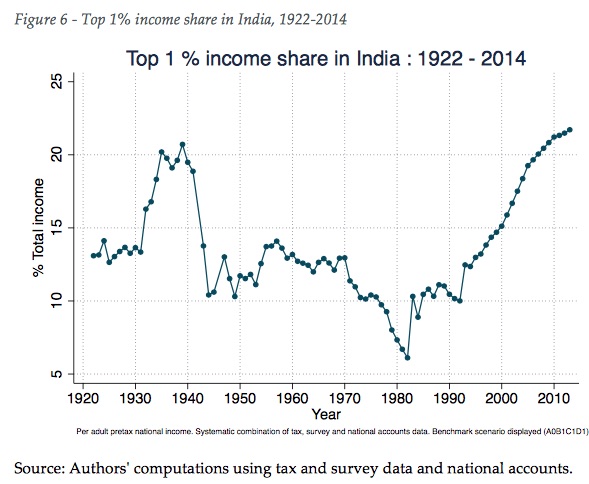
Our results exhibit a strong rise in top income shares since the mid-1980s. In our benchmark estimation scenario, the share of national income attributable to the top top 1% reached 21.7% of national income in 2013-14, up from 6.2% in 1982-1983 (see Figure 6). This is the highest level recorded since the establishment of the income tax in 1922. The top 1% share of national income was at 13% of national income in 1922-23 and increased to 20.7% in 1939-40, at the dawn of World War II.
It then dramatically decreased to 10.3% in 1949-50 and further decreased from the late 1960s to the early 1980s.
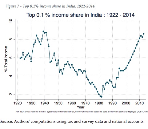
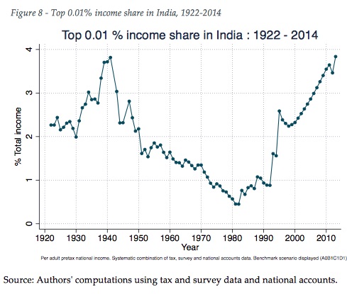
As expected, the top 0.1% income share dynamics exhibit a similar pattern in our benchmark scenario (see Figure 7). Top 0.1% earners captured 8.6% of total income in 2013-2014. This only slightly below its pre-independence peak of 1939-40 (8.9%). The top 0.1% then saw a strong drop during World War II (down to 5.5% in 1944-45), followed by a continued reduction up to 1982-83 (when it reached 1.7%). From 1983-84 onwards, the share of national income accruing to the top 0.1% rose almost continuously. Looking at the 0.01% earners (Figure 8), we also observe a strong increase in their share of national income since the mid 1980s, reaching 3.8% in 2013-2014, up from 0.4% in 1982-83. In 1941-42, the top 0.01% earned 3.8% of total income. The share of national income earned by the top 0.001% share is presented in the Appendix and also display a sharp since the mid-1980s.
3.2 Fall in Middle 40% and bottom 50% shares
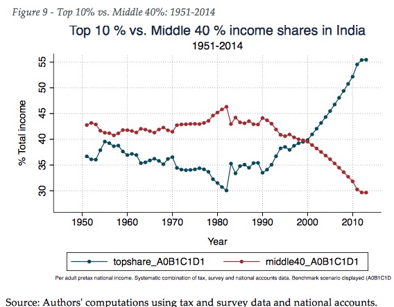
We now turn to post-1951 results, which we have for the entire distribution of income. Figure 9 shows the mirror evolution of top 10% share in total income and middle 40% share (i.e. individuals above the bottom 50% earners and below the top 10%). In the mid-fifties, the top 10% and the middle 40% held about 40% of total income each, the share of the middle 40% progressively increased from the mid-fifties to 1982-83, reaching 46% of total income. It then decreased afterwards. At the turn of the Millenium, the top 10% and the middle 40% groups captured exactly the same amount, 40%. However, by 2013-14, the middle 40% share had fallen to an historically low level of 29.6%.
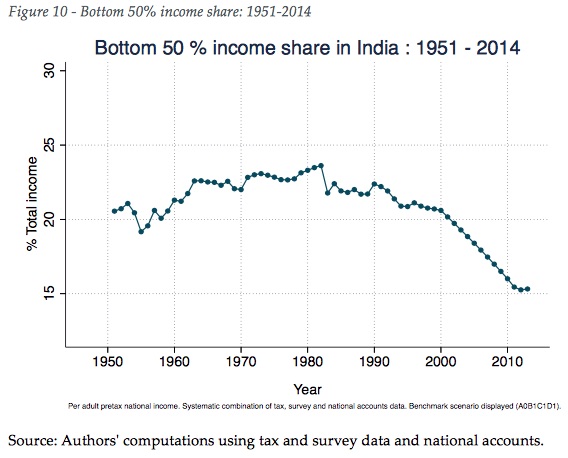
The dynamics for the bottom 50% of the income distribution exhibit a similar pattern to that of the middle 40% (Figure 10). Bottom 50% share of national income increases from 19% in 1955-56 to 23.6% in 1982-1983, but then decreases sharply and almost continuously thereafter (20.6% in 2000-2001 and 14.9% in 2013-14).
3.3 Total growth rates by income group
We compare total growth rates across the full distribution of incomes over the 1980-2014 period and compare these results in perspective to other countries available in the WID.world database, namely China, France and the USA. We also provide global growth estimates for the corresponding global groups.
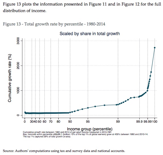
Figure 11 shows that income growth rates in India over the 1980-2014 period substantially increase as we progress upwards through the distribution of income. The bottom 50% of earners experiences a growth rate of 97% over the period, while the top 10% saw a 376% increase in their incomes. The equivalent figures for the top 0.01% and top 0.001% were 1834% and 2776%, respectively. Appendix 10 shows the same results on an annual growth rate basis. Unequal growth dynamics over the period are not specific to India. Income growth rises the higher up the income distribution one proceeds in China, in the USA and in France as well. India's dynamics are, however, striking: it is the country with the highest gap between the growth of the top 1% and growth of the full population. It is also interesting to note that bottom 50% of earners grew three times more slowly in China than in India, the middle 40% six times more slowly than their Chinese counterparts, but that the incomes of those at the very top of the Indian have grown at a faster pace than in China.
While Figure 11 is particularly meaningful from the perspective of individual growth dynamics, it is also useful to balance this with information on the share of total growth captured by different income groups (Figure 12). Indeed, income growth per adult growth can appear high for certain groups, but can represent little from the perspective of total growth at the country level. Our results show that the top 0.1% earners captured more total growth than the bottom 50% (12% vs. 11% of total growth) over the period. The top 0.1% of earners represented less than 800 000 individuals in 2013-14, this is equivalent to a population smaller to Delhi's IT suburb, Gurgaon. It is a sharp contrast with the 389 million individuals that made up the bottom half of the adult population in late 2013. At the opposite end of the distribution, the top 1% of Indian earners captured 29% of total growth, as much as the bottom 84%. The comparison of these figures with China and other countries is particularly noteworthy. Out of the four countries, India is the country where the middle 40% benefitted from the least from total growth over the period. The bottom 50% however captured a similar share of total growth in India and in China (respectively 11% and 13%).
Figure 13 plots the information presented in Figure 11 and in Figure 12 for the full distribution of income.
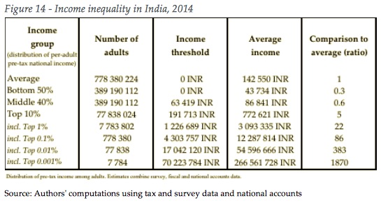
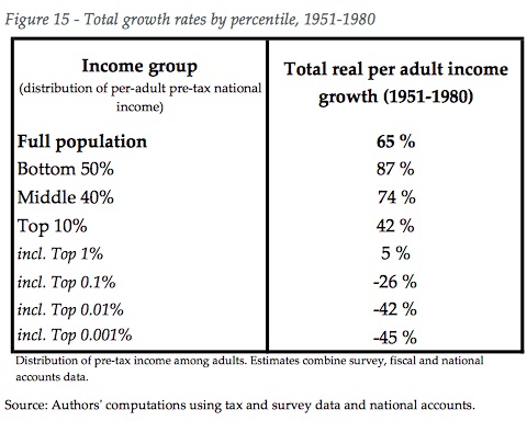
Figure 14 shows income levels and income thresholds for different groups and corresponding adult population size in 2013-2014. Top 1% earners earn on average INR 3.1 million (22 times national average) versus INR 43 734 (0.3 times national average) for the bottom 50% and INR 86 841 (0.6 times national average) for the middle 40%/ Figure 15 shows the growth rate over different income groups in India for the 1951-1980 period. The situation is reversed as compared to the 1980-2014 period: the higher the group in the distribution of income, the lower the growth rate over the period. Real per adult income of the bottom 50% middle 40% groups grew substantially faster (respectively 87% and 74%) than average income (65%). On the contrary, top 0.1%, top 0.01% and top 0.001% income groups experienced a severe decrease in their real incomes (-26%, -42% and -45% respectively). Figure 16 reveals that bottom 50% group captured 28% of total growth over the 1951-1980 period, vs. 49% for the middle 40% and 24% for the top 10%.
3.4 Growing share of income gap explained by top incomes
We compare the theoretical fiscal income obtained from national accounts21 to our reconstructed fiscal income and the total income estimated from household surveys. This comparison reveals the share of survey and national accounts discrepancy discussed in section 2.1.3, that can be attributed to the absence of top earners in survey data. We find that our reconstructed fiscal income bridges a growing and non-negligible gap between national accounts surveys data. The share of the gap explained by our reconstructed fiscal income rises from about 0% in 1990 to more than 28% in 2014.
3.5 Measurement issues and robustness tests
One of the main assumptions underlying our results is that tax data measures the actual income shares of the richest. There are a number of reasons why this may not entirely be true. A potential issue with tax data is that the surge in top incomes may reflect improvements in the income tax department's ability to measure and tax the incomes of the richest. The tax cuts in the early 1990s might have reduced the incentives among the wealthy for evading the income tax. Indeed, there were a number of innovations in tax collection in the 1990s, such as the 1998 introduction of the "one in six rule" that required everyone who satisfied at least one of six criteria (such as owning a car and travel abroad) to file a tax return. We note however that the overall decline in the top marginal rate was quite moderate: the top marginal tax rate dropped from 50% in 1987-1988 to less than 40% in 1999-2000 (and only minor evolutions after, see Figure 18). By comparison, the share of the top 0.01% was huge: it went up from 0.7% in 1987-88 to more than 2% in 1999-2000. If this entire change is to be explained by a shift in tax rates, the implied elasticity would have to be enormous. Another key limitation of the Indian tax series is the ten year break from 2000 to 2010. We did not find evidence of significant changes in the tax legislation, that could explain the rise in top shares post-2000. We also note that the post-2000 rise does not mark a discontinuity in the series, but comes more as the prolongation of rising top shares trend observed in the 1990s. The trend is also in line with the rise of inequality observed in consumption surveys and in wealth rich lists. The release of tax tabulations for the years 2000 to 2010 would allow us to better analyze year-on-year evolutions for this crucial period.
In order to test the robustness of our results to data limitations (including the tax data gap of the 2000s and the growing gap between national accounts and consumption surveys), we present our results along the 54 estimation strategies described in section 2.2.6. These 54 scenarios reflect a wide range of alternative assumptions to make up for the lack of consistent data for the entire distribution of income. We find that our main results are robust to all the strategies tested.
Appendix 12 shows the evolution of the top 1%, 0.1% and 0.01% shares from 1922 to 2014 across the 54 scenarios, along with our benchmark series (thick red line). The results only differ slightly between the different scenarios before 2005. In 1982-83, the top 1% share indicates 5.5% in the lower case scenario vs. 6.6% in the upper case. After 2005, the spread between scenarios is higher: top 1% income shares indicate 21.4% in the lower case scenario and 29.6% in the upper case scenario in 2013-2014. The higher spread after 2005 is essentially due to strategy B assumptions (ie. whether NSSO consumption surveys in 2005 and 2010 are rescaled upwards). Our benchmark strategy consists in rescaling the income levels estimated from AIHS upawards - on the basis of IHDS data - to temper the rise in top shares at the end of the period. Considering these assumptions, the trends are remarkably similar across all scenarios, but the true top share values could be higher than what we obtain in our benchmark results.
Results for the middle 40% and the bottom 50% groups are relatively more sensitive to our sets of scenario assumptions, as Appendix 13 and Appendix 14. We find a 2.5 p.p. spread on lower case and upper case scenarios for middle 40% shares on average and an average 8 p.p. spread for bottom 50% income shares. This spread is essentially due to assumptions on the savings profiles of lower consumption groups (strategies A0, A1, A2). The A0 scenario reflects a mid-range position between the 0 negative assumption (scenario A2) and the profiles obtained from the IHDS dataset, with arguably excessive negative savings rates. Long run results for bottom 40% and middle 50% groups are consistent across all scenarios: a slight increase from 1951-52 to 1983-84 and and a significant decrease afterwards.
To sum up, we see our set of alternative scenario assumptions as a way to shed light on the gaps in our current knowledge of Indian income inequality. Our results are robust to a wide range of alternative assumptions but we do not pretend that these new series are definitive. More modestly, we hope they can encourage the publication of full series from 2000 to 2010. All computer codes are provided in the data appendix of the paper and can be used to produce alternative strategies, if novel data addressing current gaps were to be released.
4 DISCUSSION
4.1 The mid-1980s turnaround
Our findings confirm and amplify the conclusions of Banerjee and Piketty (2005) on Indian inequality in the long run, namely i) a marked decrease in inequality in the early fourties ii) an even stronger reduction in top income shares in the 1950-70s and iii) a significant increase from the mid-eighties onwards. Current income inequality in India is higher than during pre-independence period. This holds true from the creation of the Income Tax in 1922 to independence in 1947 when comparing the top 1% share of national income, but also for the pre- 1922 period. Before 1922, the best available estimates show that the top 0.1% income share varied between 5 and 7% of national income vs. more than 8% today in our benchmark, conservative scenario.
We note that the reduction in top income shares was smaller during the interwar period than the reduction which occurred throughout the 1950-1970s. This seems consistent with the interpretation posited for industrialized countries' (Piketty, 2001; Piketty and Saez, 2003). The shock induced by the Great Depression of the 1930s and the War had relatively lesser impacts in India than in the USA and Europe. In India, strong government control along with an explicit goal to limit the power of the elite23 seems to have played a key role in reducing top income inequality after independence in 1947. The set of "socialist" policies implemented up to the 1970s included nationalizations, strong market regulation and high tax progressivity. Railways were nationalized in 1951, air transport in 1953, banking in 1955, 196924 and 1980, oil industry in 1974 and 1976 to cite but a few. Along with the transfer of private to public wealth and reduction of capital incomes they implied, nationalizations came along with government setting over pay scales. In the private sector, incomes were constrained by extremely high tax rates: between 1965 and 1973, top marginal tax rates rose from 27% to 97.5%25 (Figure 18). Such evolutions may have reduced rent-seeking behavior at the top of the distribution via a process of discouragement, which in presence of excessive bargaining power and rent-seeking is the efficient thing to do (Piketty, Saez, Stantcheva, 2014).
As discussed in section 1.1, from the early 1980s onwards, the Indian economy underwent reverse transformations. The turnaround of income inequality (in 1983-84, see Figure 6 to Figure 10) seems consistent with the implementation of a new economic policy agenda to disengage the public sector and to encourage entrepreneurship as well as foreign investments. The start of the process has been associated with the nomination of Rajiv Gandhi as Prime Minister in 1984.
In terms of tax progressivity, however, the downwards trend in fact started earlier - in the mid-1970s (Figure 18). That said, marginal income tax rate remained at fairly high levels until 1984-85 when Rajiv Gandhi's government reduced the rates from 62% to 50%. Why year 1983-84 marks so abruptly the turning point of our inequality series over the recent period remains a topic of enquiry. Several factors can be at play: anticipations in the 1984-85 change in the top marginal tax rate, and anticipations of a more pro-business environment, could have had a positive impact on top incomes, in line with the rent-seeking theory posited by Piketty, Saez and Stantcheva (2014). Other factors could include the combination of a strong recession in the agricultural sector the previous year (-5% agricultural production due to severe droughts in 1982-1983), which impacted income groups at the bottom. A surge in top earners filing tax returns, because of less stringent tax policies, is not to be excluded and could explain why the change is so abrupt this year. However, the fact that the rise in inequality is prolonged throughout the 1990s and in the recent period shows that this factor is very unlikely to play decisive role in the observed trends.
Available macro series also show that the wage share in the private corporate sector has been declining in India since the early to mid-1980s (in contrast to the 1970s, when the profit share was declining; see Nagaraj (2000) and Tendulkar (2003), which is consistent with the time for the turnaround proposed here.
Our results are also consistent with the evolution of Indian wealth inequality according to All-India Debt and Investment survey data (Anand and Thampi, 2017). Recently released wealth inequality estimates indeed show a sharp increase in wealth concentration from 1991 to 2012, particularly after 2002. The increase in wealth inequality at the top of the distribution is a logical outcome of the highly unequal income growth we report in this paper over the recent period.
4.2 Shining India for the rich mostly?
Our results shed light on a particularly striking characteristic of Indian growth over the past three decades: the very moderate rise of the "middle class" - at least defined as individuals above median income and below the top 10% earners. Incomes of the middle 40% grew at 102% over the 1980-2014 period. Compared to industrialized countries' growth rates for this group, the figure is impressive. In the Indian context however, the middle 40% were notably below average growth (187%). Since 1980, the middle 40% group in India captured a much smaller share of total growth (25%) in than its counterparts did in China or Europe (more than 40%) or even the USA (33%). This result should help us better characterize what has been termed as "the rise of India's middle class". From the perspective or our newly income inequality dataset, "Shining India" corresponds to the top 10% of the population (approximately 80 million adult individuals in 2014) rather than the middle 40%. Relatively speaking, the shining decades for the middle 40% group corresponded to the 1951-1980 period, when this group captured a much higher share of total growth (49%) than it did over the past forty years. It is also important to stress that, since the early 1980s, growth has been highly unevenly distributed within the top 10% group. This further reveals the unequal nature of liberalization and deregulation processes. India in fact comes out as a country with one of the highest increase in top 1% income share concentration over the past thirty years.
5 CONCLUSION
We combine historical and novel tax data with household surveys and national accounts data in order to produce the novel estimates of the full distribution of adult pre-tax income in India, from 1951 to 2014 and for the top 1% of the distribution from 1922 to 2014.
We document a large increase in the level of inequality in India over the recent period and a large increase in the current level as compared to survey-based statistics generally used in public debates. We find that our results are robust to a large set of alternative estimation strategies addressing important data gaps. According to our benchmark estimates, the top 1% income share is at its highest level (22%) since the create of the Income Tax during the British Raj, in 1922. Top income shares and top income levels were sharply reduced in the 1950s to the 1970s at a time when strong market regulations and high fiscal progressivity are implemented. During this period, bottom 50% and middle 40% incomes grew faster than average. The trend reverted in the mid 1980s with the development of pro-business policies.
We certainly do not have the capacity to put an end to debates over the impact of economic reforms on inequality or poverty India. Our contribution is in fact relatively modest; better data series on the distribution of income inequality can and should lead to better informed democratic conversation on the state of the Indian economy. We stress the need for more research dedicated to reconcile micro and macro estimates of income and consumption inequality in India. Efforts following the Distributional National Accounts Guidelines (Alvaredo et al., 2016), published on the WID.world database, seek to go in this direction. Ultimately, meeting this objective will not be possible without the participation and expertise of official statistical agencies, in India and elsewhere.
BUT: ‘a massive positive change in lives’ of UP SCs
Chandra Bhan Prasad, How Piketty Got It Wrong, Sep 19, 2017: The Times of India
A study by acclaimed French economist Thomas Piketty and his team, titled `Indian income inequality, 19222014: From British Raj to Billionaire Raj?' claims inequality in India is at its highest since 1922. This has made development economists and policy makers anxious about whether India is on an appropriate growth trajectory.
Let's consider the state of affairs through the looking glass of those at the bottom of the inequality pile.
In village Lakhmir Gadhi, Bulandshahar, five tractors are parked outside Thakur Hamendra Pal Singh's capacious house. A big zamindar in pre-Independence times, the family imported a tractor in 1947. Less than a mile north of the Thakur house lies a large mango orchard with 200 trees.
Close to the Thakur house live 45 Dalit families, who once worked for the Thakur clan only . In terms of house sizes, land ownership and other assets, Dalits are still far behind, too unequal to merit any comparison with the upper caste families. Most Dalit families live in tiny houses, landholdings are smaller.
None owns a tractor, nobody owns a mango tree, leave alone mango orchards.Wealth, income, asset based inequality between Thakurs and Dalits remains huge. What however has transpired during the past 70 years, in particular following the 1991 reforms, is beyond the critical capabilities of thinkers like Piketty who are born in caste-neutral societies.
Dalit women around Lakhmir Gadhi village don't visit Thakur homes, leave alone work for them. Dalit men trek to nearby Khurja town each morning to find work in the pottery industry. Dalit children crowd school buildings. “They are free now,“ says Thakur Hamendra.
Freedom apart, Dalits in the vicinity have acquired new food sources. Millets are history . “We eat the same wheat, same pulses, same rice that Thakurs eat,“ says Narendra Kumar, a Dalit with a PDS shop. “We too wear dresses that Thakurs do.“ Some 500km east of Bulandshahar, in Naya Gaon Panchayat in UP's Sitapur district, there are identical tales.Thakur Suresh Singh has a house, built in 1802, that is large enough to house a dozen Dalit families.
The 50 Thakur households own most of the farm land. Any wealth based inequality count between Thakurs and Dalits would be capacious indeed. But as in Lakhmir Gadhi village, Dalits in Naya Gaon have crafted a different trajectory.
Men take local trains to Lucknow and Sitapur daily . Women step out only to work in their farmlands. Children go to schools. The fact that the Thakur hamlet, once home to over 400 bullocks, has none today is because the Dalits who tended to them and tilled their land have alternative employment. “They no longer need us.There is no difference in what we wear and eat as them,“ rues Thakur Suresh Singh.
Three hundred km east, in a village in Azamgarh district, there's an identical narrative. “Thakur women began sobbing before us,“ recalls Delhi based academic Shubha Parmar. “Because the Dalit women no longer work for us, we have to sweat it out,“ a Thakur woman told her.
A seminal study led by Devesh Kapur of the University of Pennsylvania, published in 2008, found a massive positive change in the lives of UP Dalits.For the study field work, we covered 19,087 Dalit households in Bilariaganj block of Azamgarh (east UP) and in Khurja block, Buland Shahar (west UP).
We found that only 0.1% Dalit households in Bilariaganj, and 0.2% household in Khurja block worked as halwahas, a job where families would be tied up with landlords on an unending basis. Also, in both the blocks, over 99% Dalit families had stopped eating millets. In other words, Dalits in both the blocks had acquired food source equality.
In a society like India, income, asset, wealth based index of inequality means very little. The traditional indices ignore crucial social indicators such as caste regulated humiliations and indignity .Even worse, the income based indices of inequality may in fact be undermining the freedom argument.
For instance, inequality gap between a landlord and his workers may be far narrower than inequality gap between a billionaire and his workers. Howsoever unequal workers under a capitalist boss may be, they are freer than their counterparts in the countryside working for landlords.
Worse even more, reverse this inequality logic to craft an equality index for Dalits. A Dalit hamlet, let's say of 100 families, work for the village landlords.Given their occupations, wage payment pattern, and incomes, the entire Dalit hamlet may be more equal than unequal in living conditions, shared agonies, distress levels and unfreedom. At this point let's say five Dalits from the hamlet escape their landlords, and land jobs in the cement factory nearby. Suddenly , income of the five Dalit households shoots up, but inequality has also been created, a split has taken place in the Dalit hamlet. Because five households are richer and freer than the rest 95.
A rising Gujarat based Dalit leader argues, almost on these lines, that the rise of enterprises amongst Dalits can result in rise of inequality among Dalits. For centuries Dalits have faced discrimination on grounds of social status, food sources, clothing, occupations and lifestyles for example, not being allowed to grow pointed moustaches. To Dalits, thus, freedom from social subjugation and caste dominance is more important than income, wealth based equality . In fact, freedom from caste order may pave the road to income based inequality.
Rural households’ incomes
2011-13
The Times of India, Jul 04 2015


Subodh Varma
92% village homes run on less than Rs 10,000 a month
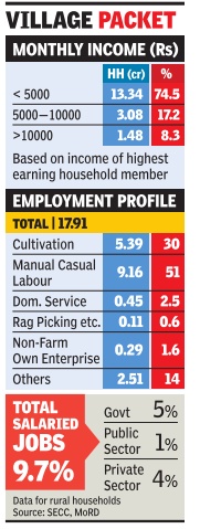
Giving a more storied picture of rural India, the Socio-Economic and Caste Census (SECC) released says that a staggering 92% of rural households reported their maximum income below Rs 10,000 per month. Nearly three quarters of all rural households said that the income of the highest earning member was Rs 5,000 or less. The SECC was conducted during 2011-12 with some states completing it in 2013, due to a lengthy process of seeking objections on collected data. It found that about 18 crore households lived in rural areas, including outgrowths of towns.
The SECC found that over 9 crore households were living by doing casual manual labour. That's more than half of all rural households. Cultivators were reported as numbering 5.39 crore households, making up about 30%. The muchheralded non-agricultural enterprises were providing livelihood to just 29 lakh households, a meagre 1.6% of the total.
There seems to be a significant difference with Census 2011 figures. The Census counts people, and according to it, in 2011 there were 9.2 crore cultivators and 8.1 crore agricultural labourers. This would translate to about 2 crore cultivator households and 1.7 crore agricultural labourer households.
However, Abhijit Sen, former member of the Planning Commission who was involved in designing the survey, told TOI that this comparison should not be done because the SECC asked about incomes while the Census asked about work.
“Also, everybody in a household doesn't work. So converting Census-based worker figures to households will not give a true picture,“ he added.
But on one issue, the SECC is perhaps better reflecting the lives of rural people. The Census gives figures for `agricultural labourers' whereas the SECC gives figures for those working as casual manual labourers, which is not confined to agricultural labour alone. Due to pressure on land,fragmentation, and low returns, a vast army of people, both men and women, are turning to any kind of casual labour to earn a living.
“Each rural household will have different kinds of casual workers. The SECC is reflecting this reality,“ Sen said.
SECC reports that only about 10% of rural households have salaried jobs. Of these, about two thirds are in public sector, and a third, 6.4 lakh in all, work regular private sector jobs. And, less than 5% of the rural households pay income tax or professional tax. This is mainly because agricultural income is not taxed and with over 92% households earning less than Rs.10,000, most don't qualify .
Urban India
No source of income for 35 lakh households
The Times of India, Jul 04 2015
35 lakh urban families have no income
At least 35 lakh families in cities and towns have no source of income while 90 lakh households are headed by women, according to raw and unreleased data from the Socio-Economic and Caste Census in urban areas, reports Dipak Dash. About 1 crore households own at least one of four items -fridges, landline phones, washing machines and twowheelers; 86 lakh households own all these.
